One of the most cutthroat markets is the food business.
In 2021, it is predicted that each individual would bring in $1,067.28 in food sales, according to Statistics.
As a matter of fact, estimates suggest that by 2030, total worldwide consumer expenditure on food goods would have reached $20 trillion.
Think about all the aisles at your neighborhood grocery store and how stuffed they are with things.
The dizzying array of options means that it’s more important than ever for you, the producer, to set yourself apart.
These days, success or failure in the market hinges on the attractiveness and functionality of your food packaging.
Effective marketing strategies include both traditional and non-traditional methods.
There is still a significant influence that sponsorships, charity connections, and sporting events may have on the success of your product.
No matter how hard you work on your marketing strategy, it won’t amount to much if your product isn’t presented in a way that appeals to your demographic.
Creating a favorable and memorable association between your brand and the product you’re selling is essential, and you can do this by using an attractive design for the packaging of the food you sell.
It will give your items an identity, make your customers feel something, and ultimately boost your bottom line.
Consumers in the modern day are open to trying new things. This is why many food companies are spending more and more money making their products appear appetizing.
Learn about the package design process and get inspired by some of the most creative examples of food packaging in this article.
You can design your ideal packaging here online: Pacdora
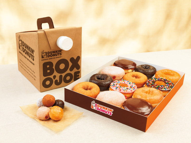
CARTON FOR DUNKIN’ DOnuts
You can design your ideal packaging here online: Pacdora
The “Donuts” part of Dunkin’s name was deleted as part of a recent rebranding effort. Dunkin’ Donuts has always been Dunkin’ Donuts, so we’re not sure why anybody would be surprised by the first fallout. It seemed incomplete without the Donuts.
It didn’t make sense at first, but after learning the reasoning for the switch (e.g., so that new consumers wouldn’t assume they exclusively sold donuts), it makes sense. Since they provide so many different items, why would they bother to put a “donut” label on a package of bagels?
People’s lives are increasingly more and busier, therefore companies and restaurants have responded by making everything from branding to food packaging more streamlined and easy to navigate. From its first location in Quincy, Massachusetts, the brand has expanded to include stores around the country, each with a welcoming, almost conversational atmosphere. The design of the box still has the eye-catching orange and pink, but in a brighter shade. Extraordinary in terms of both existing and potential new clients.
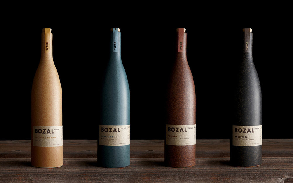
Mexico’s Bozal Mezcal
You can design your ideal packaging here online: Pacdora
Bozal is a mountain-born brand that makes highly acclaimed mezcals in Mexico’s Guerrero and Oaxaca states.
Bozal is a Spanish word that meaning “untamed,” a fitting descriptor for the Agave plants that are used to manufacture these beverages.
The unique feature of this food packaging design is the rustic ceramic bottles that are used to store the mezcals. The earthy tones, which stand in for the numerous varietals, create an upscale, classic atmosphere.
The design is simple and contemporary, and the label’s rough paper texture alludes to the arid conditions in which agave thrives. It reveals the character of the company and relates the history of mezcal.
A minimum of words were used to get this clean and uncluttered look. This drinks menu has a high-end impression thanks to the mix of serif and sans serif fonts.
The packaging effectively conveys the contents inside.
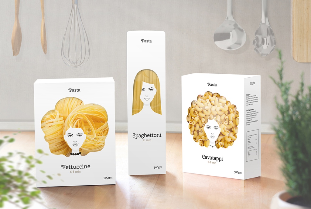
Good Hair Day Organic Pasta
You can design your ideal packaging here online: Pacdora
Greenomic’s Good Hair Day Organic pasta is a wonderful pick-me-up for design enthusiasts and foodies both.
This paper packaging boasts authentic Italian pasta made with all-natural ingredients and features a design that has won awards.
The unique package series was created with two objectives in mind: to grab consumers’ attention and to highlight the superiority of the product within.
This is a tale of effective product branding, with goods that attract attention on store shelves and leave buyers feeling cheerful and appreciative of the excellent quality of the goods they purchased.
Good Hair Day, All Natural The success of this pasta’s design proves that originality and effort can make a world of difference.
The pasta’s inherent color is brought out by the hairs’ varying textures and curls and waves. They appear really stylish when coupled with both basic writing and strong font.
Chocolates from the Loving Earth
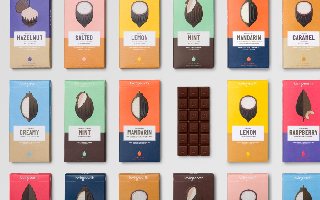
You can design your ideal packaging here online: Pacdora
Loving Earth uses only the finest, all-natural ingredients in their chocolates. In truth, the Ashaninka people of the Peruvian Amazon, where cacao first appeared, grow and harvest the raw cacao that is used.
The organic nature and high quality of these foods are reflected in the packaging’s use of bright, earthy hues.
Each variety of chocolate features large, strong fonts that highlight the flavor, and a cocoa row bean in the center of the box that both draws attention and reveals the essence of the brand.
ALE+WANG Cremes
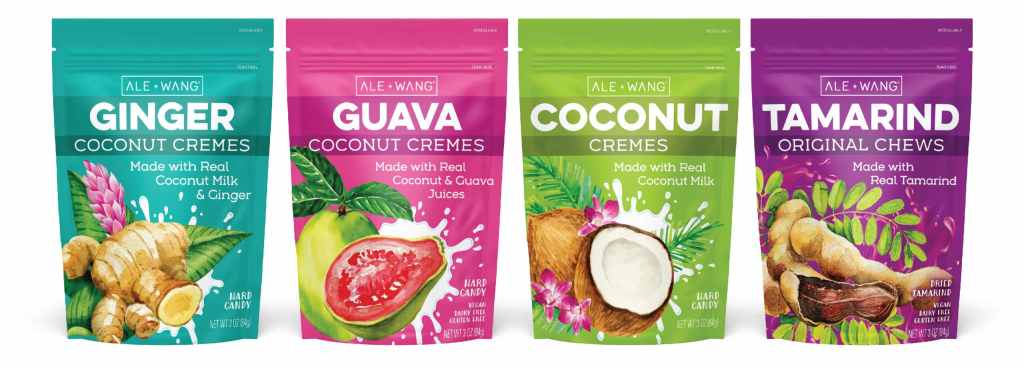
You can design your ideal packaging here online: Pacdora
The bold, bright drawings on the ALE+WANG cremes’ container design call attention to the product’s fresh, all-natural components and delicious tastes.
The label centers on these bright images, and the splash of coconut milk adds a lighthearted touch that suggests motion and vitality.
Big, strong writing that accentuates the items’ taste works beautifully with the bold, natural hues.
The firm claims that the distinctive packaging for its food items is indicative of the fact that the goods themselves foster a sense of global community and unite people from all walks of life.
The natural and refreshing appearance of this design makes these items appealing, especially as customers seek for more authentic and honest businesses.
Cacao Truffles by Willie
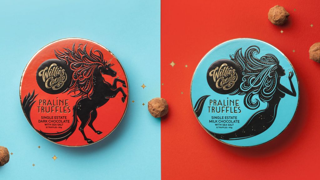
You can design your ideal packaging here online: Pacdora
Willie’s Cacao, a company that has won several awards, has released a special edition of truffles with liquid cores that are very irresistible (raspberry, matcha and roasted green tea).
The end product is a striking, opulent, and memorable design because to the rainbow of truffle colors.
Illustrations of magical creatures provide a touch of mystery and captivate buyers with their charm.
This food package design features the brand’s emblem prominently, which helps the items jump off the shelf and into the minds of the buyers.
RightRice
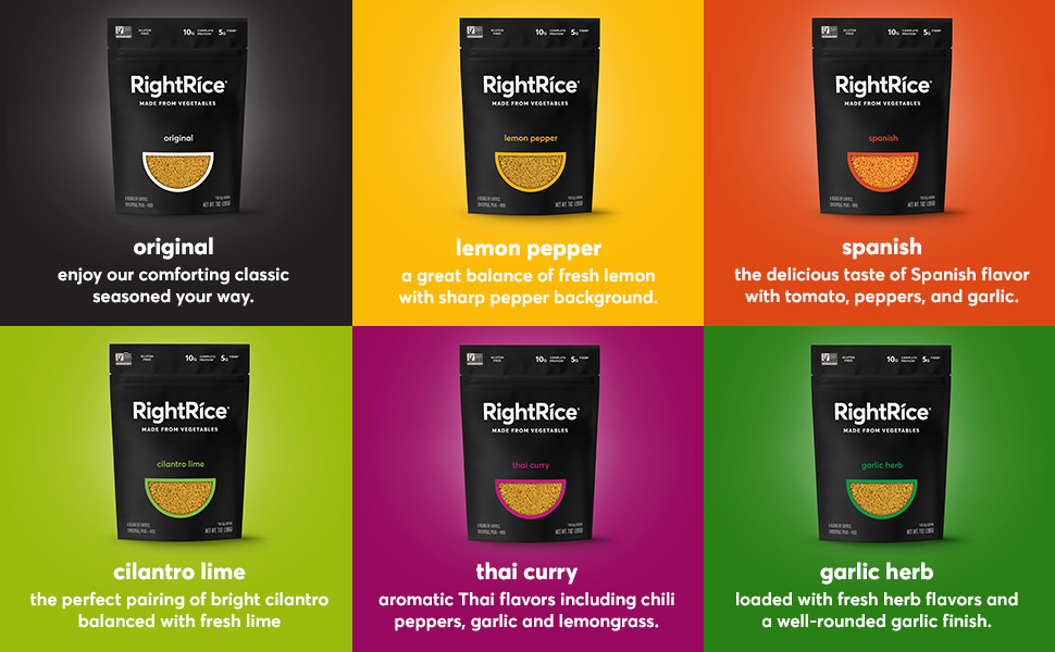
You can design your ideal packaging here online: Pacdora
Protein and fiber are abundant in RightRice, which is a grain product made from vegetables. It’s a low-carb alternative to regular white rice that doesn’t sacrifice flavor.
Garlic herb, cilantro lime, and lemon pepper are just a few of the tasty options available to customers.
This innovative food package has the shape of a bowl of rice and features a transparent glass so consumers can see what they’re getting.
The dark background and large, bold letters that spell out the name of the product provide an air of high-end sophistication, while the copy above the bowl draws attention to the healthful vegetables used in its preparation.
A simplified approach to food packaging has helped Betterer Foods increase their market share and variety of offerings.
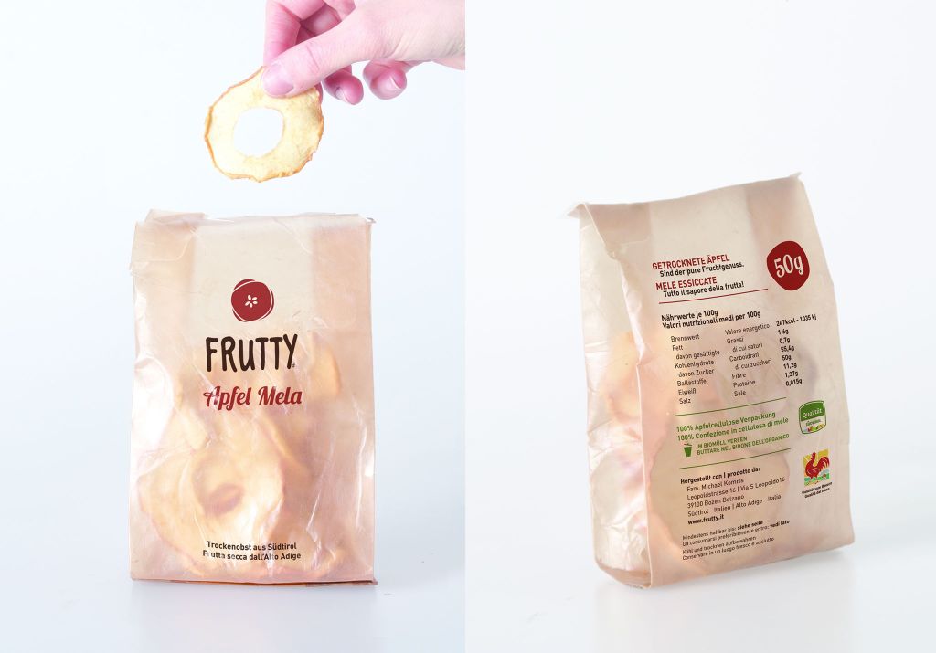
EMMA SICHER FRUIT AND VEG PACKAGING
You can design your ideal packaging here online: Pacdora
A lot of people are talking about sustainability in the context of food package design.
You’ve probably all seen TV shows about how plastic waste is ruining marine life since you know how much plastic we consume. This is an extremely important consideration for both designers and their clients.
Also, there are some efforts to reduce or eliminate plastic use. After finishing her studies at The University of Bozen-Bolzano in Northern Italy, 23-year-old Emma Sicher sought out an alternative career path in the food packaging sector. She has made wrapping sheets for fruit and vegetables out of food scraps.
While this isn’t yet a widespread solution, it is indicative of a shift toward considering truly innovative approaches to the packaging of our food that are also environmentally friendly.
This should not be an afterthought but rather a primary concern for designers and clients alike throughout the duration of the project.
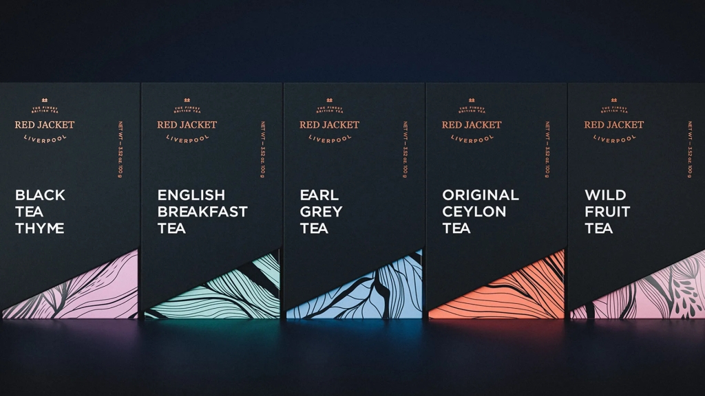
PACKAGING FOR RED JACKET TEA
You can design your ideal packaging here online: Pacdora
The foiling method really helps to convey the luxurious, high-quality feel of this tea’s container.
All of the tea boxes look excellent together, and the delicate designs on them make it easy to visualize the subtle brushstrokes of tea and water blending as the tea is steeped in hot water.
Everything about the package screams “quality” and always delivers on that promise. It’s important to remember that the print processes and finishing choices you choose for a product’s packaging can have a significant impact on the consumer’s perception of your brand.
BRANDLESS PACKAGING
Brandless is a food and drink manufacturer that aims to eradicate brand names from the retail food business. Supplanting it with the ubiquitous white cube that bears their logo. All goods must be treated equally, after all.
Although it may sound strange coming from a designer, I really enjoy this. However, “it does what it says on the tin” has become a marketing catchphrase in a world of brand cacophony and highly engineered food packaging. This packaging accomplishes exactly what it promises it will do.
Even though I’d be out of a job if this became the norm, it’s important to remember that a streamlined approach doesn’t have to sacrifice effectiveness for the sake of simplicity. Now that most people are paying attention to the ingredients in the food they eat, any effort made to make this data readily accessible would likely be well received.
ARCHER FARMS COFFEE PACKAGING

You can design your ideal packaging here online: Pacdora
The artful Archer Farms coffee package exemplifies the trend toward using illustrations as design elements.
Its usefulness and capacity to differentiate itself from other coffees on the store are what really stick out to us about this one. Detailed information on the product’s roast, flavor, and provenance may all be found in the grid at the top of the package. More goods may be made that are still in keeping with the established brand thanks to the adaptability of this element on both white and black.
The pictures really put the icing on the cake. This is a major current trend in beverage and food product package design; nevertheless, it may not be beneficial to your company. However, these cases of packaging that are both fair trade and internationally sustainable function quite well.
PACKAGING FOR COOP’S OWN BRAND OF ALCOHOLIC BEVERAGES

You can design your ideal packaging here online: Pacdora
More and more consumers these days choose store brands over name-brand foods and beverages. Supermarkets must have noticed this, because they have recently started to put more effort into the presentation of their own private label brands. The alcohol packaging at the Coop is one of the greatest examples we’ve seen.
The packaging design is very much indicative of a tiny, independent brewery, while still maintaining a consistent visual aesthetic.
The use of oversized, eccentric fonts helps it stick out drastically on the shelf. The design has an arrogant air to it that you wouldn’t expect to find in store brands in the supermarket.
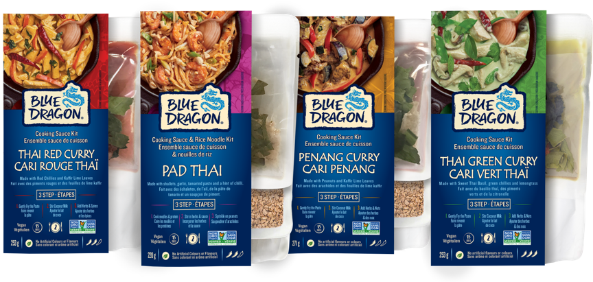
BLUE DRAGON PACKAGING
You can design your ideal packaging here online: Pacdora
The previous, dull packaging for Blue Dragon food has been replaced with a brand-new, colorful design that also takes into account the brand’s Asian heritage. The vibrant colors and complex flavors of Asian cuisine were lost on the previous packaging. The revamped packaging adds vibrancy to the brand’s image, making meal preparation a more joyful process.
The new packaging reflects the dynamic nature of Asian culture by presenting items in a less stuffy way, encouraging consumers to let their individuality shine through when cooking.
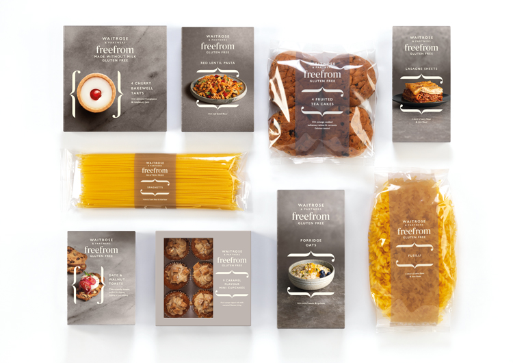
WAITROSE FREEFROM PACKAGING
You can design your ideal packaging here online: Pacdora
New free from product packaging from Waitrose has been unveiled. The packaging is an evolution of the waitrose aesthetic while still retaining the store’s signature vibe. Putting the dishes on display in a more casual environment to highlight how appetizing they seem. It stresses that even if you choose healthier eating choices, you won’t have to sacrifice flavor.
The packaging subtly incorporates the “freefrom” name by framing each product with two brackets that resemble lowercase F’s.
MARKET PANTRY PACKAGING
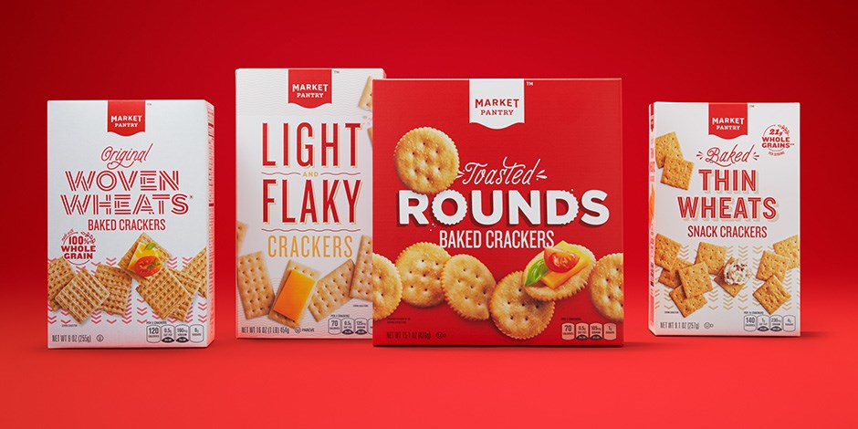
Market Pantry was an early supermarket own brand that looked somewhat bland. Their decision to rebrand and update their food packaging resulted in a style that was explosively bright, colorful, and powerful. In their place are fresh, appetizing-looking photographs of each product that are paired with engaging, expressive writing and whimsical artwork.
Consumers may now have faith that they are purchasing a high-quality, delectable product because of the packaging’s new, more professional appearance. It’s adaptable because it has a wide variety of components that may be employed as needed for every given product without diluting the brand’s overall identity.
Packaging by KALLO
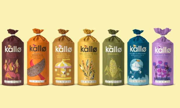
Kallo is a popular food brand known for its nutritious snacks and tasty meals. For want of a better description, the old design of their healthy food packaging lacked flavor. However, the new and improved packaging for their healthy food adds a welcoming and engaging touch to the nutritious contents.
They employ such rich and enticing hues that your mouth will start watering even before you open the package. Whoever claimed that eating healthy had to be dull and unpleasant clearly hadn’t seen this brand’s packaging, which has a number of friendly graphics that hit all the right buttons in relation to the product’s being healthy and organic.
ANNA’S PACKING & ANNA
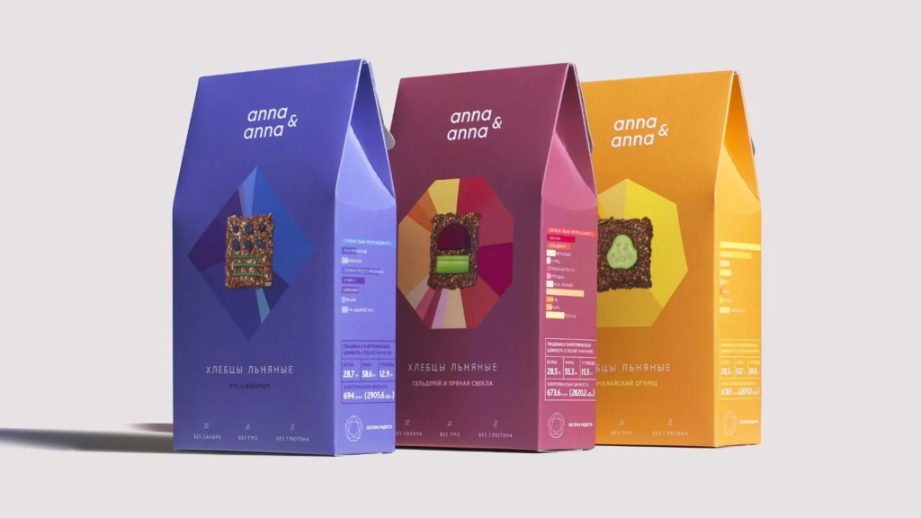
The food package design by Anna & Anna features strong, vibrant colors and a simple layout to highlight the product within. It’s not all it seems, though…
The background shapes behind the product shot add a lovely splash of color to complement the primary color. They are also an informational graphic outlining the product’s constituent parts. You can tell exactly what’s in your meal and how much of it there is thanks to the color-coded information on the side. A creative representation of information that is typically an afterthought on packaging.
If a fact or piece of data “needs to” be on the package, consider how you may present it in a way that is useful to the buyer.
PACKAGING FOR COFFEE BARIS AND COFFEE CUBES
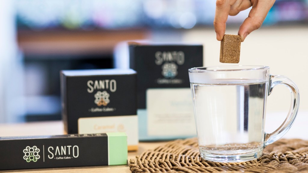
A refreshing departure from the norm, this design’s minimalist aesthetic and small form create a strong first impression on store shelves.
Its sleek presentation conceals what is actually a complex procedure. The packaging is a major selling element since customers can see the product before they buy it. In fact, the Coffee Pod packaging nearly makes the product appear like a collector’s item, like the mint-in-box Star Wars miniatures I still have in my loft.
Therefore, before considering any lovely graphics of our goods or anything like that, you may want to consider just showcasing your product, as this may have a profound influence on customers and may sway them to choose your product.
PACKAGING CHON CHONER
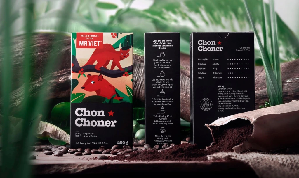
Mr. Viet’s coffee is known as Chon Choner. A premium coffee, rumored to be among the world’s most costly.
Therefore, it is quite unexpected to find a whimsical image on the front, as this style is more commonly associated with lower-priced products. However, the use of a gorgeous graphic to promote the coffee’s exotic origins in Vietnam is a smart move. The Mr Viet. line, from coffee beans to packaging, has a distinct aesthetic because to its liberal use of imagery and big, strong typography.
Taking a risk like this might pay off in the form of innovative packaging that stands out from the crowd.
MO ICE CREAM BOXES
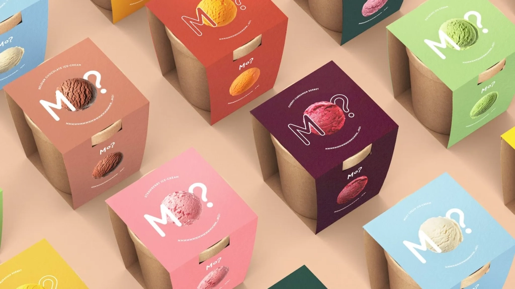
Packaging like this makes it quite easy to express interest in “MO?”re.
The vivid colors on the box mirror those of the product depicted there, making it appear all the more appetizing. Since the packing for this method contains no extraneous material, it is easy to understand and to the point.
A brilliant example of how keeping things simple may help get your brand’s message through via packaging.
LUXEROSE COCKTAIL PACKAGING
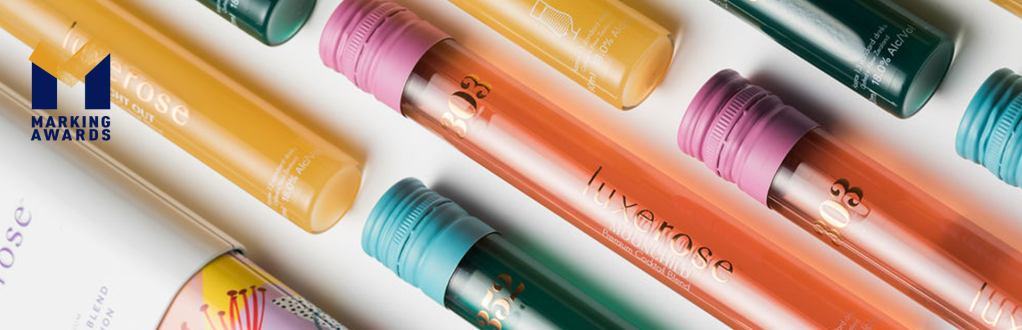
In terms of packaging, Luxerose is on another level. Their modest box gradually transforms into a beautiful kaleidoscope of art and color.
The desire to come across differently and distinguish out is essential as the cocktail and similar drink business has grown to be so large (whatever happened to a bottle of brown and a G&T, by the way).
The cocktail blends from Luxerose come in convenient tubes that may be dispensed straight from the tube into the provided container. A neat and tidy approach to reporting on any gathering or presenting any present. The drinks within are shown with colorful flower patterns that match the container. This is not at all like the packaged or canned versions of this product.

Leave a comment