In your packaging, are you seeking for a natural winning fraction? Try the elegant color of black.
The phrase “packaging design” is wide. It consists of your box’s design, particular characteristics, and printing methods, among other things. Choosing your color, however, is among the most crucial steps.
On the surface, it appears to be quite simple. Why not select your preferred color?
You can do that, but doing so will almost always end in a communication and branding disaster.
The sin is one that package designers also commit. Their works might be dazzling if they are allowed much freedom. Or simply wasteful in general.
Colors are significant for a variety of reasons.
Every single one of them has a distinctive impact on your consumer. Not a scam, either. Purple is frequently connected with creativity, whereas white stands for innocence and purity.
They exhibit your ideals.
They elicit certain responses from your customers.
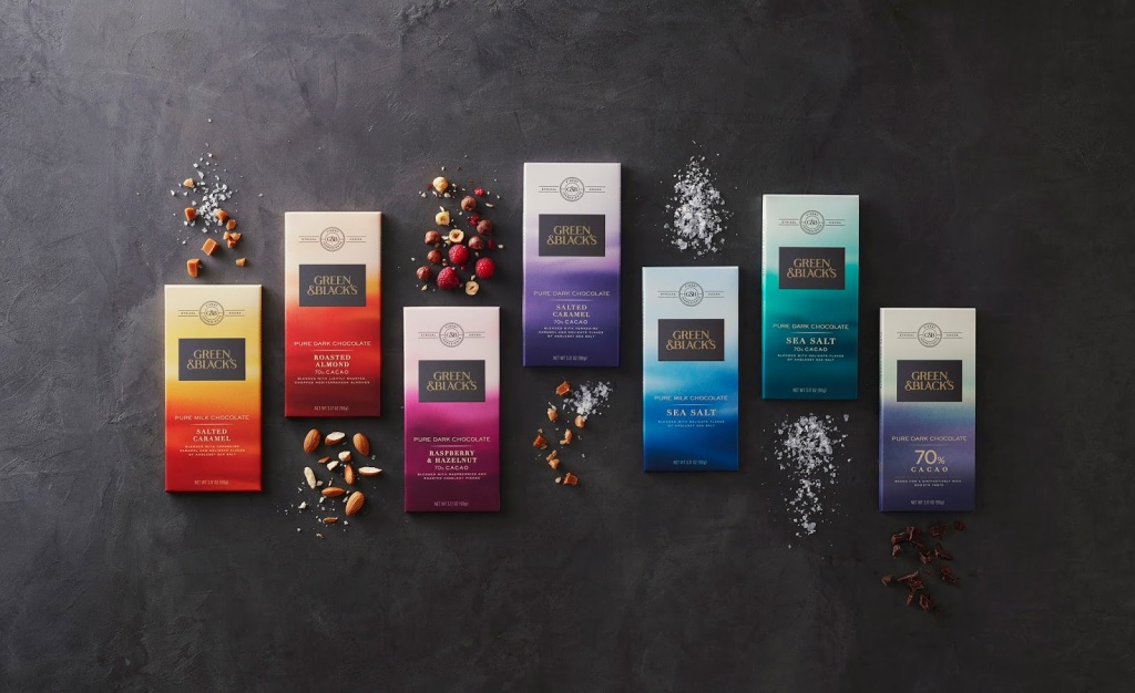
When grocery shopping, you probably won’t come across too many products whose packaging is all black. If you need any assistance with that, I am here to provide it. So that you may get some ideas, I’ve compiled a long list of fantastic black food packaging designs.
All of the food boxes should be black. As far as appearances go, there isn’t much to debate. However, as I said before, black food packaging is unusual. The mystery is in the why. Is it because one of the most flattering hues is overlooked in favor of more mainstream options?
Since of the message it conveys. Even while it may not make sense, one of these is the pursuit of luxury. Black food packaging that is made to seem spectacular and costly may turn off more potential buyers than it attracts.
In such a circumstance, the product’s perceived value may be more important than its actual cost. Take a closer look the next time you’re at the store if you don’t believe me. I’m willing to bet that you haven’t bought the most costly, most decadent chocolate that you could possibly locate. The converse is also true; things that appear inexpensive may really be rather pricey. In addition to the price tag, the packaging may also convey important information.
What does the color black represent?
It logically goes with the word “premium.” Like the tiny black dress or a dapper tuxedo, quality black packaging exudes a sense of refinement and elegance.
It has an air of refinement about it and goes well with cardboard boxes that are white, gold, or silver. It’s hot and new, let’s face it. Black is exclusive, yet many brands are still hesitant to use it.
In the ten instances that follow, we will demonstrate how effective this decision is.
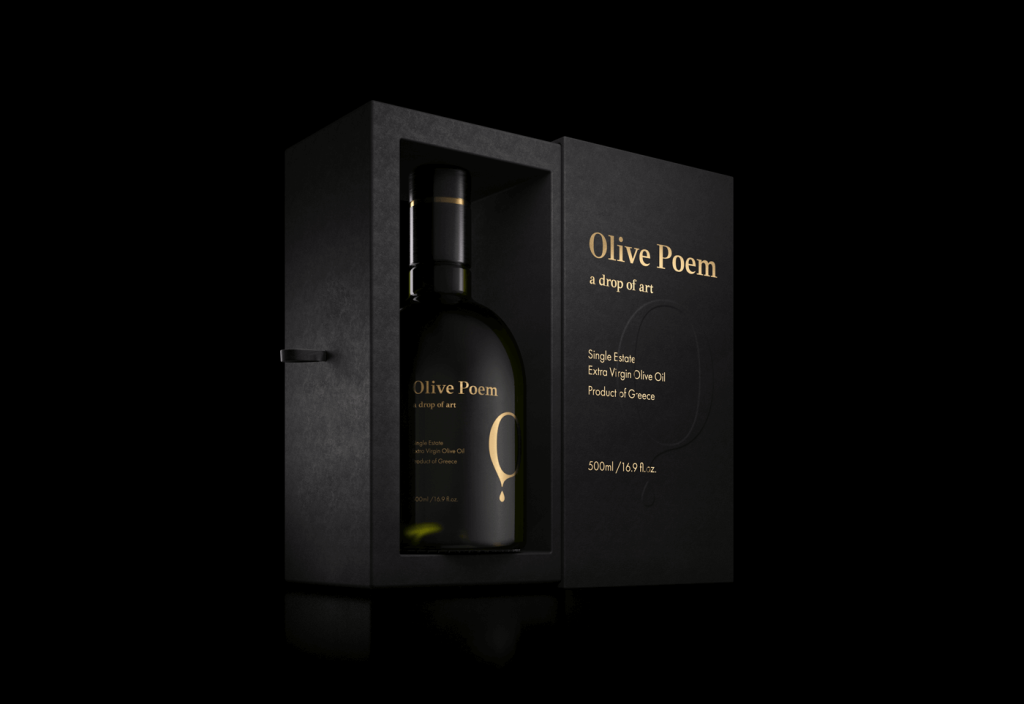
Matt and Black Olive Poem
You can design your ideal packaging here online: Pacdora
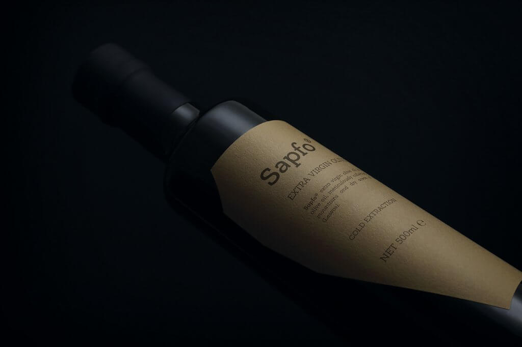
We came across the idea of Olive Poem on Behance, and it quickly captured our attention. The virgin oil bottle is intended to be displayed by the packaging. It makes use of a winning color scheme of black and gold, which you ought to incorporate into your Christmas packaging as well.
How does Olive Poem inspire people?
Examine the outside packaging’s texture more closely. The matt finish celebrates the product’s incredibly premium nature. Such a choice is available in our Full-Color Mailer Boxes as well.
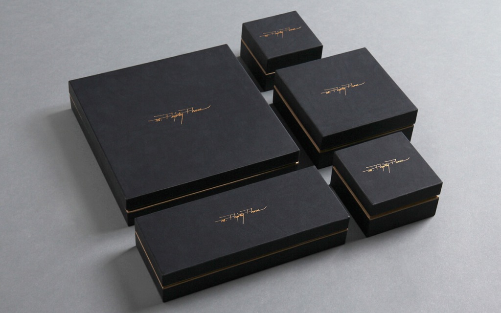
No.Thirty-Three – Subtlety of gold
You can design your ideal packaging here online: Pacdora
You should keep in mind that there are many different hues of black while printing. While we often advise choosing a certain shade of “deep black” for packaging, there may be a few subtle differences. This packaging was created by the Hong Kong-based design firm No. Thirty-Three and has a two-piece box with a subdued gold printing on top.
What do you stand to gain?
You may apply a similar idea of a tiny logo piece printed in gold when creating your package. This is a true detail.
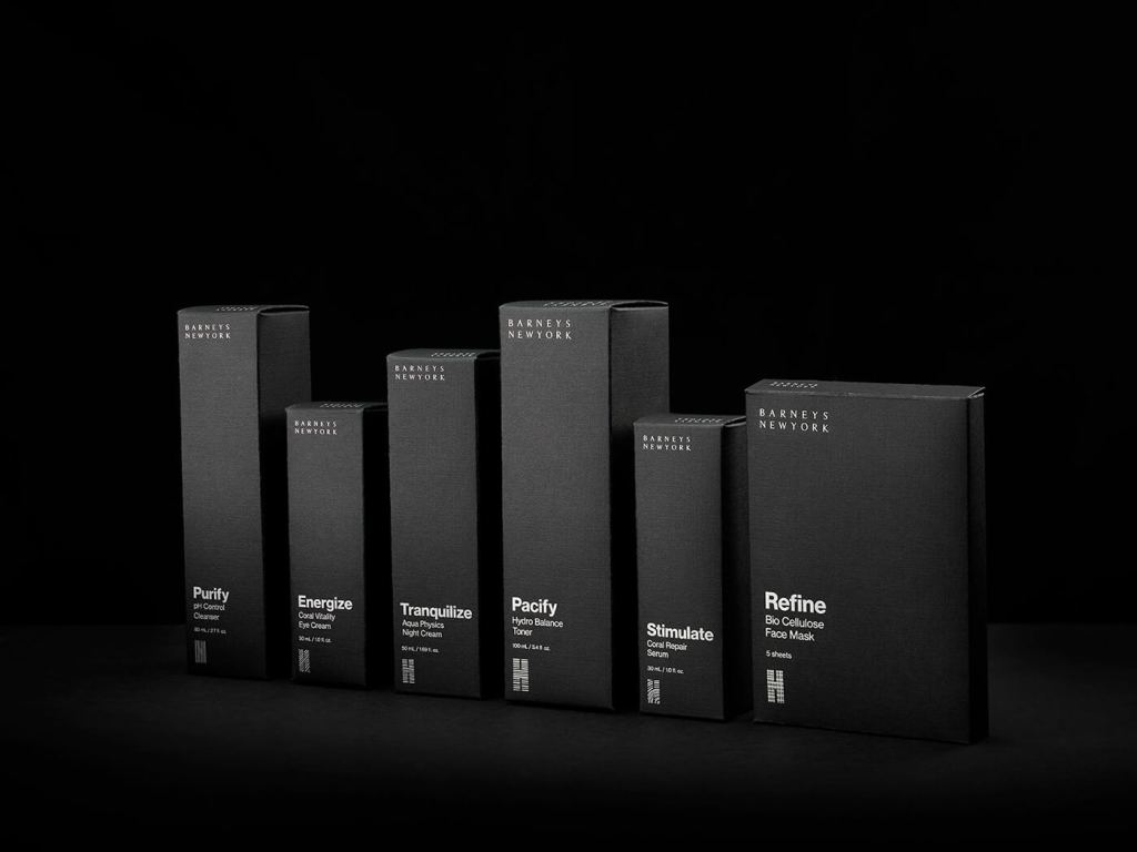
Beautiful simplicity at Barneys New York
You can design your ideal packaging here online: Pacdora
One of our favorites among the dark package ideas is this gorgeous effort. Its simplicity is alluring, and it doesn’t take the simple route. The pattern combines bits of silver that have been hot-stamped with white or gold.
Use hot-stamping as well in your design. With the help of this printing process, your logo may perform wonders for branding.
Distilled London – Black inside

You can design your ideal packaging here online: Pacdora
eCommerce retailers selling apparel frequently employ tissue paper (mostly premium brands). It’s a lovely touch that improves the aesthetic and the unpacking experience. The natural cardboard box appears much more fascinating with the black tissue paper, much like in the case of Distilled London.
How can Distilled London serve as your source of inspiration?
Simple enough: wrap your items in black tissue paper with your brand printed on it to provide a little more “wow.”
Black label soy candles

You can design your ideal packaging here online: Pacdora
Not every brand will work with a black box. Making this sort of branding choice is really audacious.
Even if you decide to use natural cardboard, you can still make your design stand out using black. Similar to what the black label on these soy candles does.
You may keep your design clean and straightforward and add a black label (both awesome-looking and instructive).
Sapfo – natural and black cardboard
You can design your ideal packaging here online: Pacdora
Like Olive Poem who was described before, Sapfo also cultivates virgin olives. The package is intriguing in that it combines black with kraft’s natural color. When designing a cardboard box, that might also be advantageous for your business.
Algorithm – Add an unexpected colour
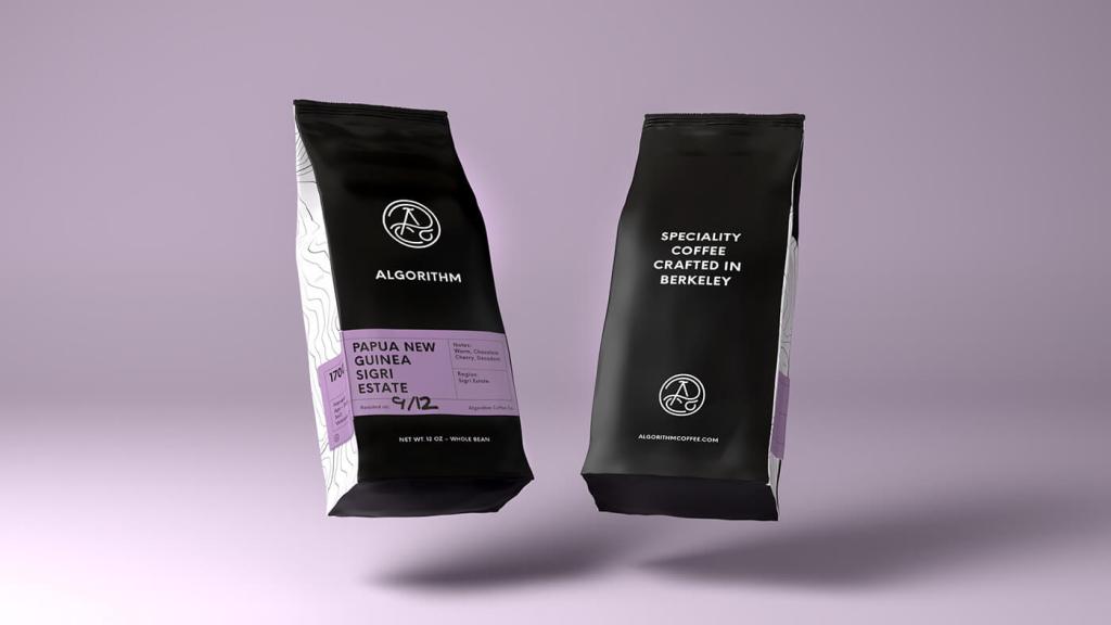
We stated at the outset of this post that black looks attractive when combined with gold and white. It makes sense, but it’s not the only interesting “partnership” that stands out.
Look at the algorithm. This coffee maker’s design, which was primarily dark, had a purple accent. The project that emerges is complex and unforgettable.
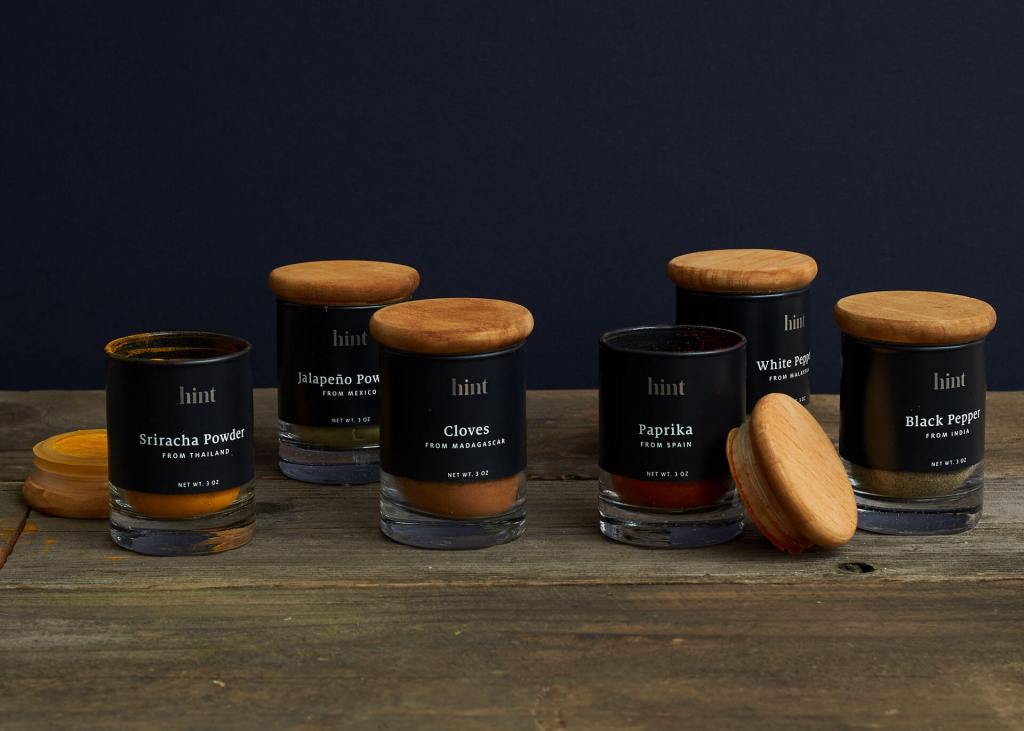
Hint: Black and wood mix together.
You can design your ideal packaging here online: Pacdora
Modern design is increasingly using wooden components and ideas. One of the causes is that wood has an elegant connotation, much like the color black.
Hint combines the two in one gorgeous design. The mostly dark container incorporates the cork and wood components.
How can you utilize Hint as inspiration for your cardboard box?
Create a dark box and add a label or sticker that looks like wood.
You can design your ideal packaging here online: Pacdora
What makes good black packaging?
Great packaging shows the world what you stand for, makes people remember your brand, and helps potential customers understand if your product is right for them. Packaging communicates all of that through color, shape and other design elements. Learn how to make your black packaging tell your brand’s story.
The Advantages and Disadvantages of Black Packaging
Black has been used frequently in luxury product advertising, including for ice cream, chocolate, wine, and spirits. Rarely is it used to snacks. It may even be seductive and new. It stands out well on screen, in presentation design, and in printed materials when compared to white and other light hues.
Your design team should be aware that the way a product appears on paper or in mockups does not always convey as effectively as how it appears on a shop shelf before these reasons make them fall in love with black package design. This is because many supermarkets and retail establishments are unexpectedly gloomy, despite the overhead fluorescent lighting and general image of a well lighted store.
To help the product stand out, design teams should think about including something into the packaging that makes it special, distinctive, and recognized.
Consider the general color scheme of the space where your product will be offered. The label’s elements, such as the text and photos, will stand out if the packaging is made to complement the environment it will be in.
Lien Design will assist you whether you’re considering using a solid color background for your package design or opting for a different inventive packaging design. For years, this San Diego branding and graphic design agency has worked with businesses to develop packaging designs, resulting in items that truly stand out on grocery store shelves. Contact Lien Design to discover what they can do for you if you want your product to be the one people see first.
Why Black Packaging Is Being Used by Brands
Black is a hue of authority and represents many things, including money, elegance, and power. Some marketers claim that Black’s recent surge in popularity might be related to consumers’ need for high-quality goods at affordable prices. And nothing says “luxury” quite like black. Let’s explore this idea in more detail. For instance, a person who cannot afford a high-end luxury automobile would not mind purchasing a slightly more expensive beer if doing so allowed them to experience an aspirational product without going into debt.
This trend is being adopted even by tonics. Take Black Tonic, which Atlantic Grupa introduced last year and enjoyed tremendous popularity in the Balkans market.
When utilized in packaging, the color black inspires feelings of majesty, mystery, and elegance. It unquestionably gives any packaging a degree of increased perceived worth. Black has made a comeback as one of the major trends in package design after years of White dominating the industry. We are overjoyed that it is receiving recognition, and we can’t wait to see how businesses use it in next packaging!

Leave a comment